
Let's use an example. Here's a spreadsheet being used to record retail sales at three stores:

We'd like to see a graph, or chart, of this information to help us visualize store sales.
First, select all the cells containing the data that you want to chart. Notice that we include row and column labels (but not totals data) in our selection. By doing so we will incorporate them directly into the chart.

Now select either the New Chart icon ![]() from the toolbar or the Chart... command from the Insert menu:
from the toolbar or the Chart... command from the Insert menu:
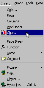
Insert/Chart... will start the Chart Wizard. The Chart
Wizard will walk you through step-by-step the dialog boxes for creating
a chart. At each step default answers are provided, so that for most dialog
boxes you can simply choose ![]() .
The following dialog box is Step 1 of 4 on your way to creating a chart:
.
The following dialog box is Step 1 of 4 on your way to creating a chart:
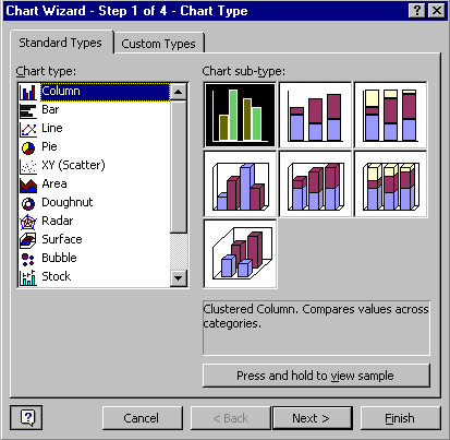
The left side of the Standard Types tab asks "What type of chart do you want"? Choose one of the fourteen general chart types that are available in Excel by clicking on its icon. The right side of this tab shows the sub-types for the selected chart. Select one of the sub-types displayed on the right or accept the default which is the sub-type in the upper left-hand corner. Notice that when you select a sub-type a short explanation is given. This explanation can help you decide which chart type and sub-type to use.
You can press the ![]() bar
below the sub-types to see a miniature version of your chart.
bar
below the sub-types to see a miniature version of your chart.
Select ![]() to
proceed to Step 2:
to
proceed to Step 2:
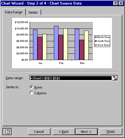
The Data Range input box reflects the original selection you
made. You can change it by clicking on the ![]() button
and selecting a new range from your spreadsheet. The Series in radio
button allows you to control how results are displayed on your chart. In
the example above we are interested in the comparison between stores (rows)
so we choose rows to represent series data. (The columns, then, represent
categories.)
button
and selecting a new range from your spreadsheet. The Series in radio
button allows you to control how results are displayed on your chart. In
the example above we are interested in the comparison between stores (rows)
so we choose rows to represent series data. (The columns, then, represent
categories.)
Select ![]() to
proceed to Step 3:
to
proceed to Step 3:
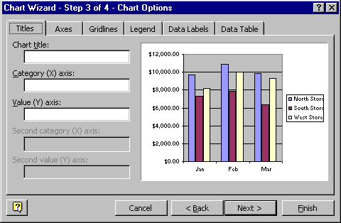
Here you can make many cosmetic changes to your chart. The changes you make are immediately reflected on the sample display so you can quickly see how each option affects your chart.
Select ![]() to
proceed to the fourth and final dialog box:
to
proceed to the fourth and final dialog box:
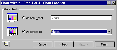
 Here
you can choose to insert your chart as an object in an existing sheet,
or as a new sheet. The default is to insert the chart into the sheet with
the original data.
In summary, there are four dialog boxes that control where and how a chart is displayed in your spreadsheet:
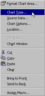
What if you later decide you want to change one of the options you specified while creating your chart? No problem. If you right-click over an open area on your chart you can select one of the four categories above to make a change. (The figure to the right shows the popup menu you will get when you right-click on an open area of your chart.)
Important: Charts are "live." That means that they respond automatically to changes in the data they were formed from. Whenever the values in our spreadsheet are changed or recalculated, all charts based on the changed cells are redrawn to match the changed data.